3rd Floor, Meenakshi Tower, Nadakkavu Road,
Eranhipalam, Kozhikode, Kerala - 673006
+91 7012 727 621
+91 7012 224 271
info@mentegoz.com
Al Ezz Tower-3 14th Floor
Safliya Street, Old Salata,
Corniche
Doha, Qatar


Our team will do their best to get back to you as soon as possible.
3rd Floor, Meenakshi Tower, Nadakkavu Road,
Eranhipalam, Kozhikode, Kerala - 673006
+91 7012 727 621
+91 7012 224 271
info@mentegoz.com
Al Ezz Tower-3 14th Floor
Safliya Street, Old Salata,
Corniche
Doha, Qatar

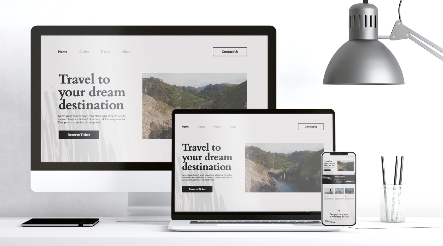
A short explainer on why modern websites must adapt to every device to deliver great user experiences, improve SEO, and build credibility.
In today’s digital-first world, your website is often the first impression customers have of your brand. With the increasing use of smartphones, tablets, laptops, and even smart TVs, users are accessing websites from a wide variety of devices. If your website isn’t optimised for all these screen sizes, you risk frustrating visitors and losing potential customers. This is where responsive web design plays a vital role.
A responsive website adapts seamlessly to different screen sizes and resolutions, providing users with an optimal browsing experience. Beyond just aesthetics, responsive design is now a strategic digital investment that directly impacts user experience, customer satisfaction, and online credibility.
The modern internet landscape is no longer defined by desktop screens alone. Today’s users expect to access content whenever and wherever they want, whether they’re using a smartphone during their commute, a tablet while relaxing at home, or a large desktop monitor in the office. If your website doesn’t deliver a smooth and consistent experience across all these contexts, you risk losing users within seconds. In fact, research consistently shows that users abandon sites that take too long to load or require excessive zooming and scrolling. This behaviour underscores why responsive web design has evolved from being a “nice-to-have” feature to an absolute necessity for every serious business.
User experience (UX) lies at the heart of every successful website. A responsive design ensures that your site looks and functions beautifully across all devices—from desktops to smartphones. When users can easily navigate your site, read content, and interact with features without zooming or scrolling endlessly, they are more likely to stay longer and engage with your brand.
A positive browsing experience translates into higher satisfaction and repeat visits, which are essential for building trust and long-term loyalty.
Consider this: when a visitor lands on a page that’s optimised for their device, they’re greeted with intuitive navigation, legible fonts, properly sized buttons, and images that load correctly. This ease of use lowers frustration and creates a natural flow through your content, guiding visitors toward taking desired actions such as signing up for a newsletter, exploring your services, or making a purchase.
On the other hand, a non-responsive site forces users to pinch, zoom, and scroll horizontally—quickly creating friction. Friction leads to abandonment, which can cost businesses conversions, leads, and revenue. A well-executed responsive design ensures that every interaction feels intentional and user-friendly.
Google has made it clear that mobile-friendliness is a key ranking factor. Websites that aren’t responsive often fall behind in search results, making it harder for users to discover them.
Responsive web design not only improves usability but also supports SEO. A single responsive site eliminates duplicate content issues common with separate mobile and desktop versions. The result? Better rankings, greater visibility, and a smoother search experience for users.
Search engines aim to deliver the best possible results to users, and part of that involves ensuring those results lead to websites that work well on any device. When your site meets Google’s mobile-first indexing standards, it signals to search engines that your content is accessible and valuable. Responsive design strengthens SEO, drives organic traffic, and ensures your users find your site easily—especially when implemented with the expertise of a trusted SEO company in Kerala.
Moreover, higher rankings naturally translate to increased click-through rates, more impressions, and stronger online authority. In competitive industries, this advantage can make a significant difference in lead generation and brand visibility.
A consistent and well-functioning website builds trust. Responsive design ensures smooth interactions, consistent layouts, and faster load times—all of which contribute to a more polished user experience.
When visitors see that your website performs seamlessly on any device, it signals professionalism, reliability, and attention to detail—qualities that reinforce brand credibility and a strong user-first identity.
First impressions matter. If a potential customer encounters a disorganised or broken layout on their mobile device, they may perceive the entire brand as outdated or unreliable. Conversely, a responsive and aesthetically pleasing website portrays a forward-thinking company that values quality and user satisfaction. This impression can make the difference between a bounce and a conversion.
Brand credibility is built not just through what you say, but through the experience you provide.
In the past, businesses often managed separate desktop and mobile websites. This approach was time-consuming and expensive.
With responsive web design, you maintain a single, unified site that automatically adapts to all devices. This not only reduces maintenance costs but also ensures a consistent experience for every user—no matter where or how they visit.
Having one website means fewer updates, less content duplication, and a simplified workflow for your web team. You don’t need to manage multiple sets of code or worry about synchronising content between different versions. Any updates you make are instantly reflected across all devices. This streamlined approach allows your team to focus more on enhancing content, features, and overall performance, rather than juggling multiple platforms.
The online space is competitive, and users won’t hesitate to leave a poorly designed website for a more user-friendly one. A responsive website demonstrates that your brand values innovation and user convenience.
In industries where user experience defines success, responsive design provides the competitive edge needed to stand out and build stronger customer relationships.
Today’s users are more discerning than ever. They compare brands not just on products or services, but on the ease with which they can interact with your website. If your competitors offer a faster, smoother, and more mobile-friendly experience, users are likely to favor them over you. By investing in responsive design, you position your brand as modern, reliable, and customer-centric.
This competitive edge is especially crucial for businesses in dynamic markets, where digital trends evolve quickly. Being responsive now ensures you remain relevant tomorrow.
With new devices and screen sizes constantly emerging, static websites can quickly feel outdated. Responsive web design, however, is adaptable and flexible, ensuring your site continues to deliver an excellent experience as technology evolves.
By investing in responsive design today, you’re future-proofing your website for years to come—ensuring every user enjoys a consistent and modern experience.
The future of the internet includes wearable technology, foldable phones, ultra-wide screens, and devices that haven’t even been imagined yet. A responsive framework enables your site to adapt gracefully to these changes, saving you from costly overhauls later. This adaptability isn’t just about keeping up with trends—it’s about ensuring that your digital presence remains stable and high-performing regardless of what the future holds.

A great example of the power of responsive web design in enhancing user experience is Jinchuart, the brainchild of Jinchu Sundar, an acclaimed Indian artist and YouTuber. Specializing in acrylic and watercolor portraiture, Jinchu’s work reflects self-taught creativity and passion.
When Jinchuart partnered with Mentegoz Technologies, an e-commerce development company, the goal was to create an immersive online experience that showcased her artwork beautifully across all devices.
Through a custom, responsive design, the online gallery adapts flawlessly—whether visitors are exploring on desktops, tablets, or smartphones. Each artwork is displayed in stunning detail, and the integrated e-commerce functionality offers a smooth, intuitive shopping experience.
Result: Jinchuart’s responsive website has become more than just a digital portfolio—it’s a dynamic platform that connects art lovers worldwide with Jinchu’s captivating creations, showcasing the benefits of custom web development in enhancing usability, accessibility, and user satisfaction.
In the digital era, your website is more than an online presence—it’s the foundation of your user experience. Responsive web design is no longer optional; it’s essential. From improving usability and accessibility to boosting SEO and engagement, its benefits are undeniable.
A responsive website reflects your brand’s commitment to quality, innovation, and customer satisfaction. It helps you reach a wider audience, improve search visibility, and stay relevant in a constantly evolving digital world.
For businesses in Calicut and beyond, partnering with a trusted Web Design Company in Kerala like Mentegoz Technologies ensures your website is crafted with responsiveness, creativity, and user experience in mind. A well-designed, mobile-friendly site doesn’t just attract visitors—it delights them, turning first-time visitors into long-term users.

New

2026-05-29
A few months ago, one business owner told us something that honestly stayed in our minds. He said, “Every morning I open my ads manager hoping to see sales. Instead, I just see money disappeari...
Read Blog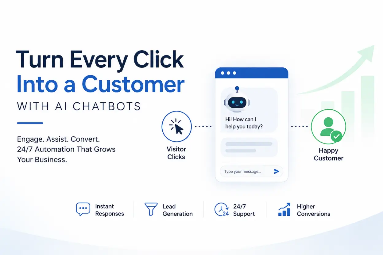
New
2026-05-25
People do not like waiting online. They want quick answers, simple steps, and a website that helps them instead of confusing them. That is exactly why chatbots have become such a useful part of modern...
Read Blog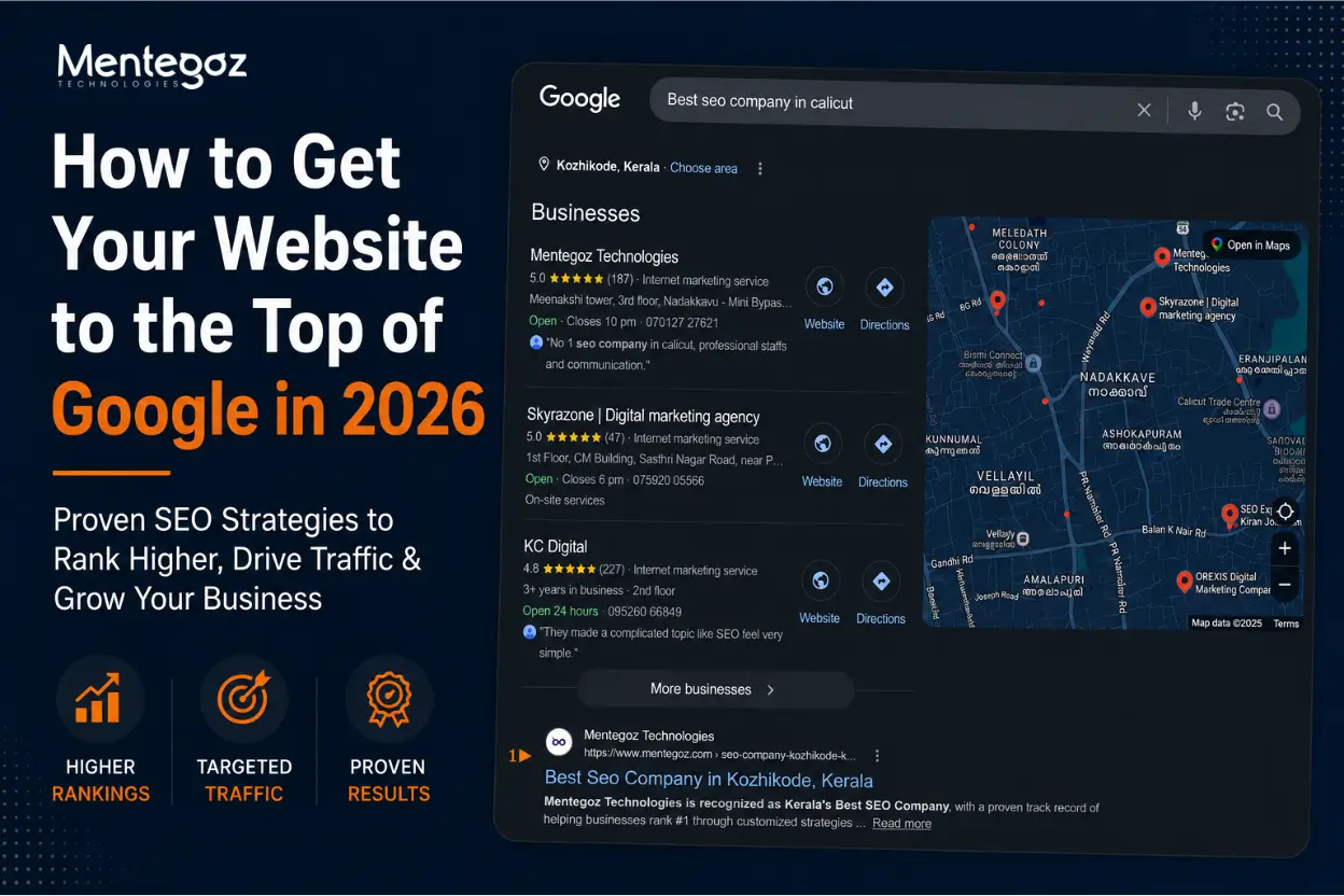
New
2026-05-20
Every business wants visibility, and in practice that usually means one thing: showing up near the top of Google when people search for what you offer. If your site is buried on page two or three, it...
Read Blog
New
2026-05-11
If you lead an online store, the words “Shopify migration” probably stir equal parts hope and fear. On one hand, you’re aiming for a faster, cleaner, and more scalable e‑commerce eng...
Read Blog
New
2026-04-25
If you’ve been in marketing for a while, you’ve probably noticed something: what worked even last year doesn’t hit the same anymore. Campaigns that used to bring in steady traffic ar...
Read Blog
New
2026-03-28
In 2026, operating a small business is both thrilling and difficult. With increasing competition and changing customer expectations, using the right tools for a small business is no longer optional it...
Read Blog
Start your project with Mentegoz Technologies and experience exceptional results that surpass your expectations. Trust our expertise as a leading digital solutions provider.


3rd Floor, Meenakshi Tower, Nadakkavu Road, Eranhipalam, Kozhikode, Kerala - 673006
Phone: +91 7012 727 621
Phone: +91 7012 224 271
HR: +91 9778 583 709
Al Ezz Tower-3 14th Floor
Safliya Street, Old Salata, Corniche
Doha, Qatar
Mobile: +974 3009 1063
info@mentegoz.com

